Ever since I remember myself I loved analyzing stuff whether it’s a situation, story, setting or vignette – it was always fascinating to learn (or at least imagine and guess) why did it happen that way, what was the reason and the result of a certain behavior etc. constantly trying to stay true to myself, striving to be the image of my opinion. So I thought a cool idea would be to bring this hobby (?) of mine to the blog, focusing on rooms that were appealing, discussing here why were they appealing. Let’s proceed :)
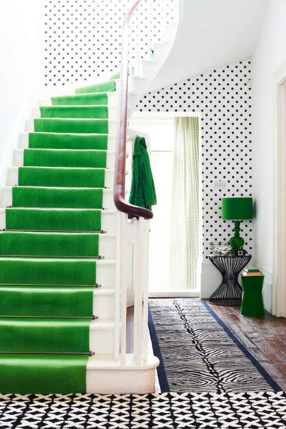
Here are the details that caught my eye:
- The bright green runner, I mean wow!, someone wanted to pop out, don’t you think? I love it, it’s the perfect amount of color in this room as it’s the only bright shade here so it doesn’t feel too crowded.
- The mix of patterns: polka dots, zebra and Xs are definitely an unexpected combo, but they somehow work out together just fine, this hallway feels playful and the black and white is softened thanks to them!
- Matching runner, lamp and stool (oh, and the coat too!) – will say it again: perfect splash of color! Fresh and modern, while remaining simple.
- The curtain – mixed feelings about this one, it’s like an attempt to make a transition from bright green to white and in my opinion it looks okay-ish, I would choose something different.
That would be it for this hallway. My conclusion? Love love love it!


